This case study was for my UX Design Certificate course. The assignment was to create a mobile application for an art gallery in Portland, Oregon.
Paper Wireframes
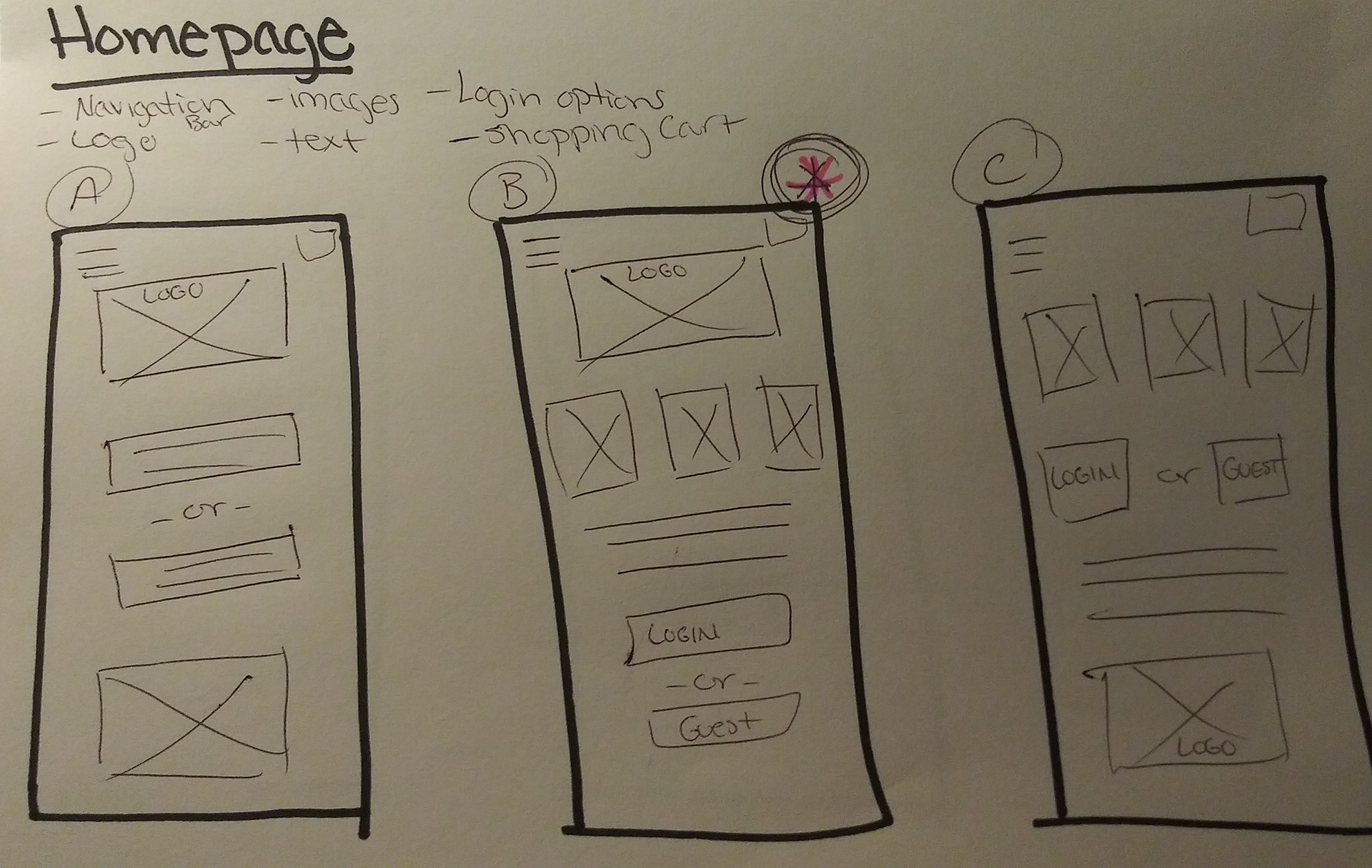
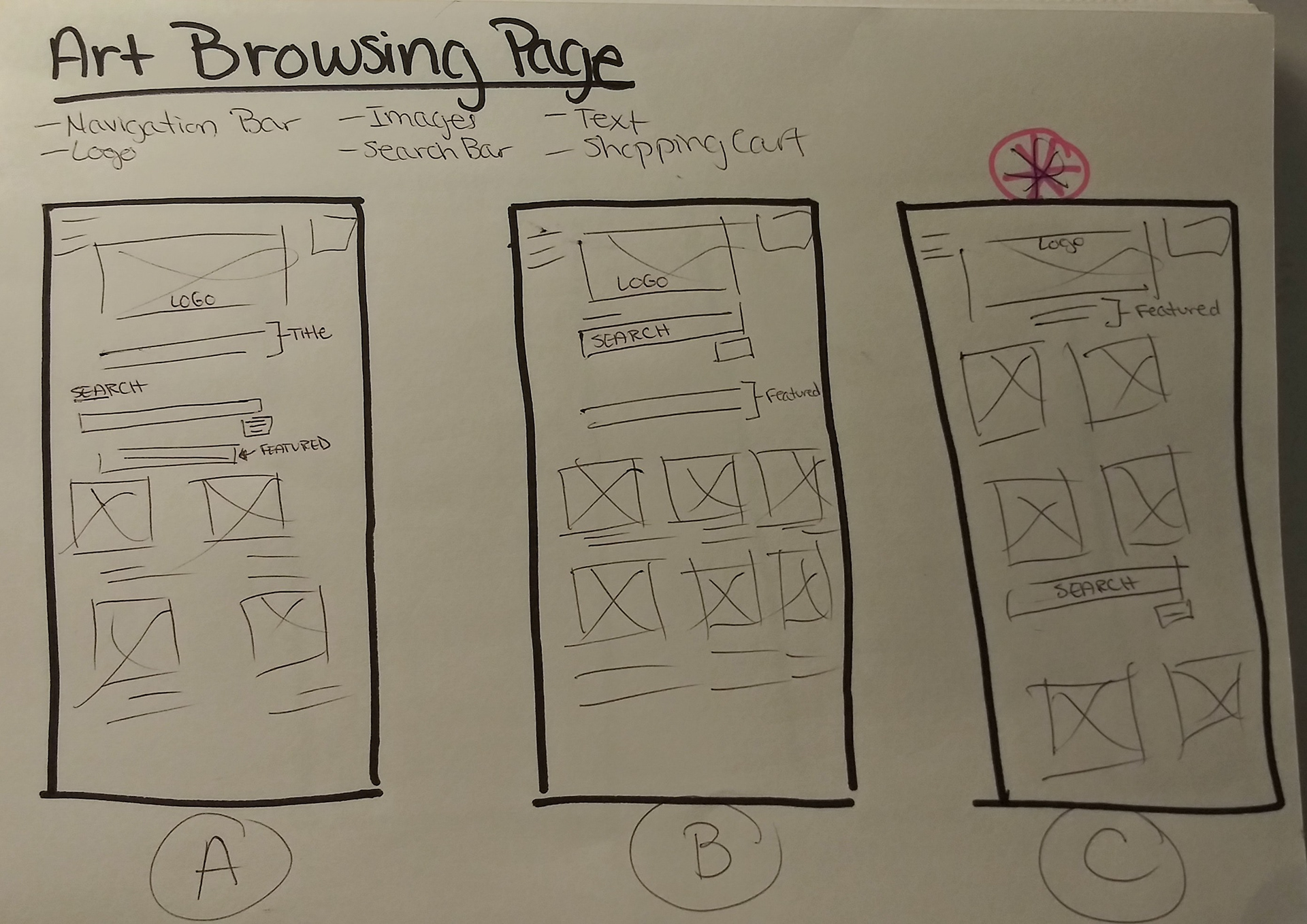
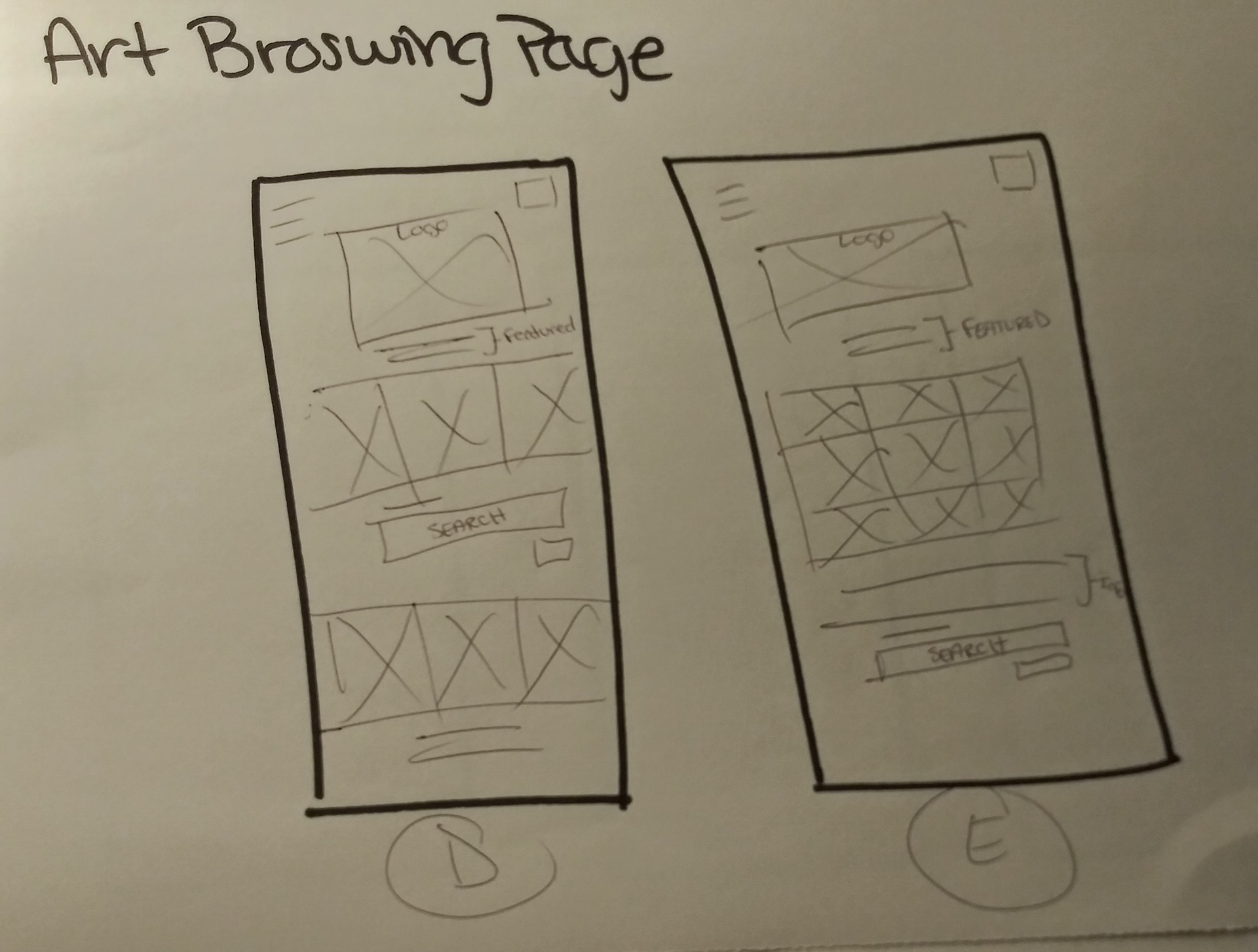
Paper wireframes were created for each page of the app. Each page has 5 different versions. With the user in mind, I chose the designs and elements that would better the user experience. The pages with a pink star and circle are the designs that were chosen to move forward.

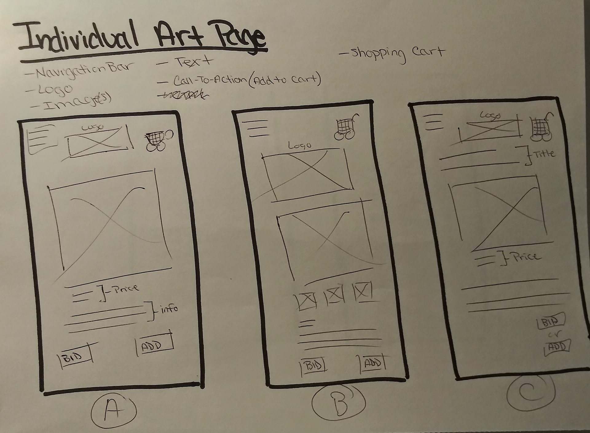
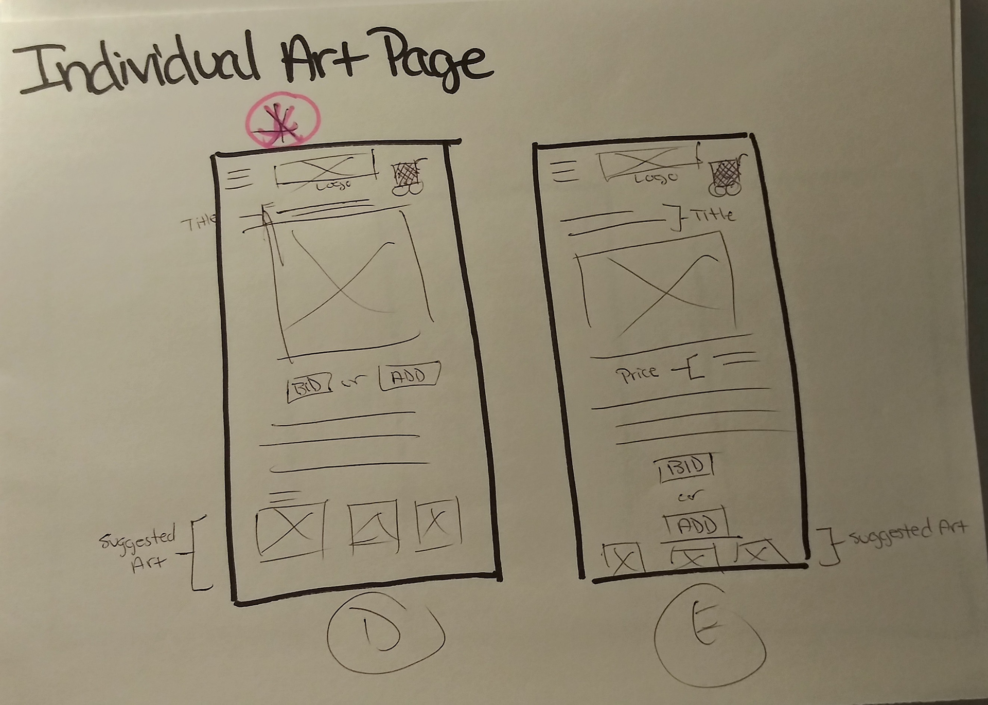
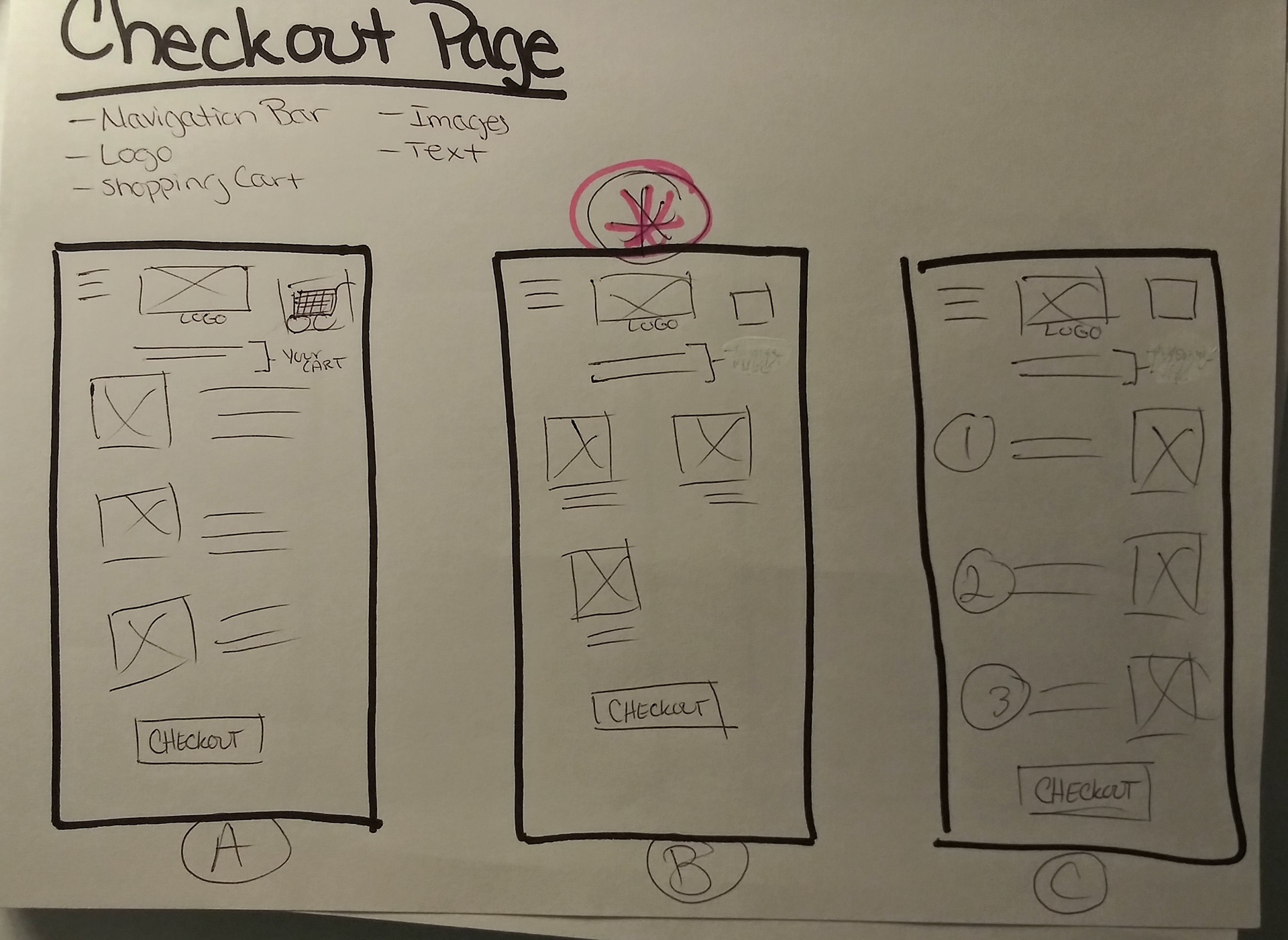


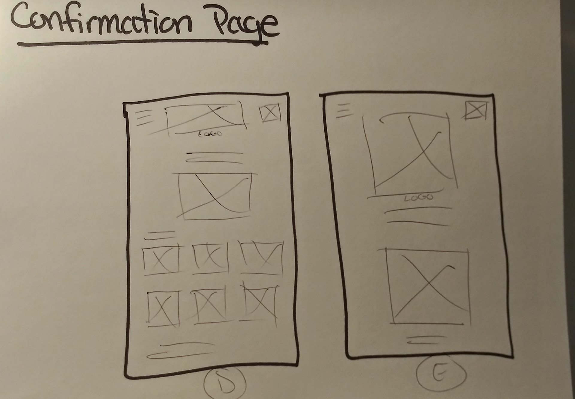
Digital Wireframes
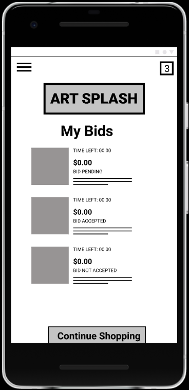
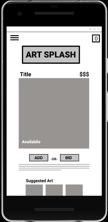
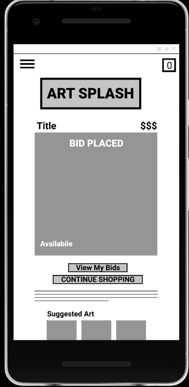
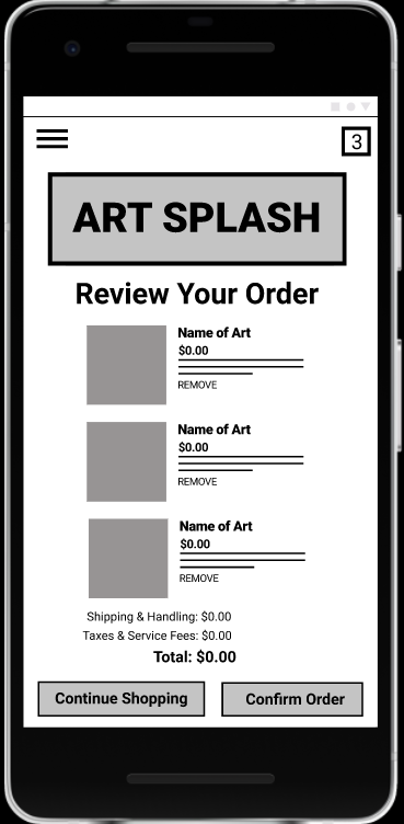
Next, I turned the paper wireframes into digital wireframes. Some changes were made when putting these together but it became easier to see some of the potential user pain points that users could face.
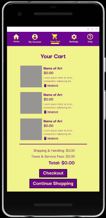
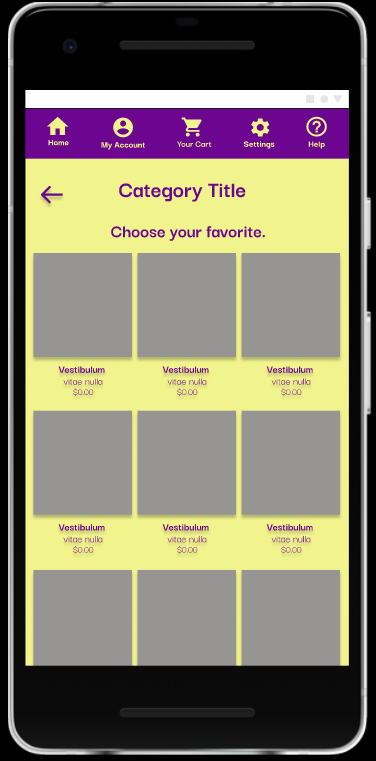
Once the digital wireframes were created, I went ahead and turned those into a low-fidelity prototype that I would use for a usability study. During the usability, users mentioned that they wanted more categories to choose from, more information about items in the cart, and a confirmation number or ETA of shipped items on the confirmation page.
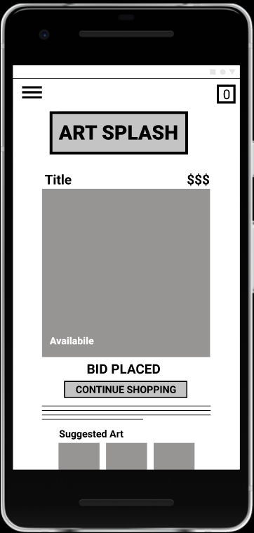

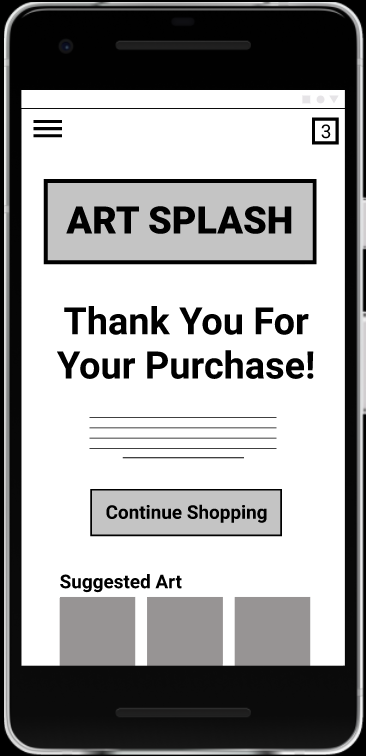
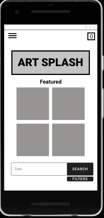

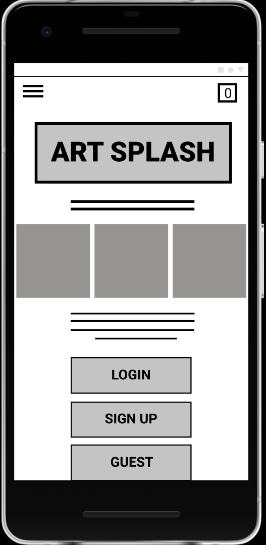
Keeping in mind the users' feedback in the usability study, I made the changes that were suggested. You can view these changes below.
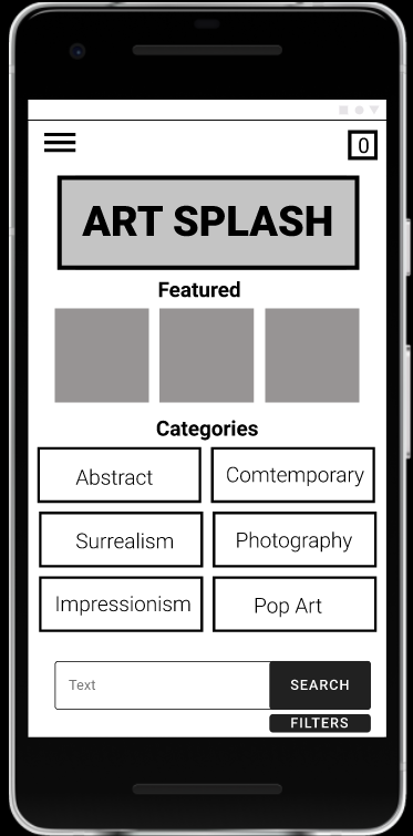

Low-fidelity Prototype
Now, it was time to put all the iterations we made to the test. Below you will find the low-fidelity prototype.
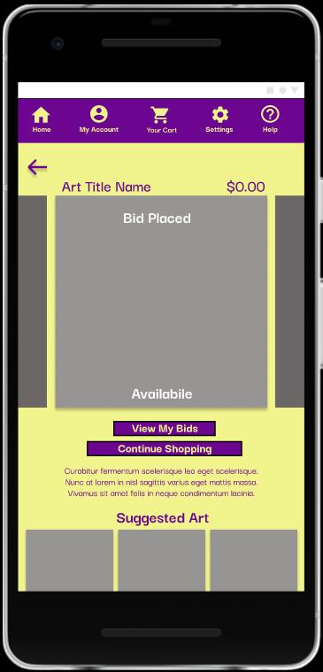
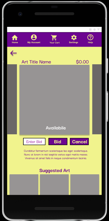
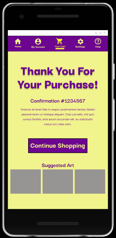

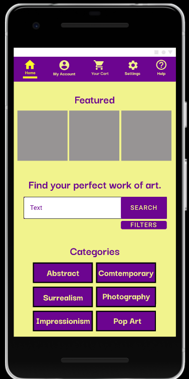
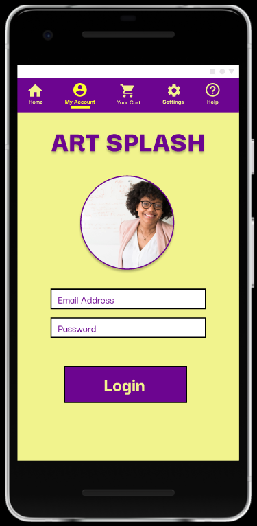
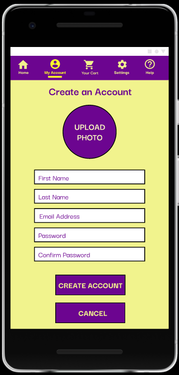
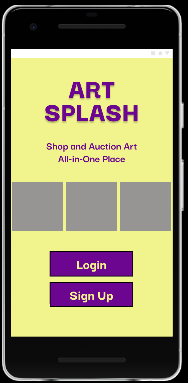
High Fidelity Prototype
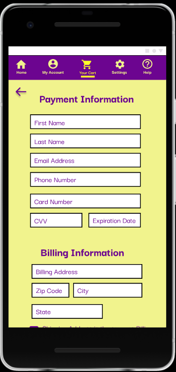
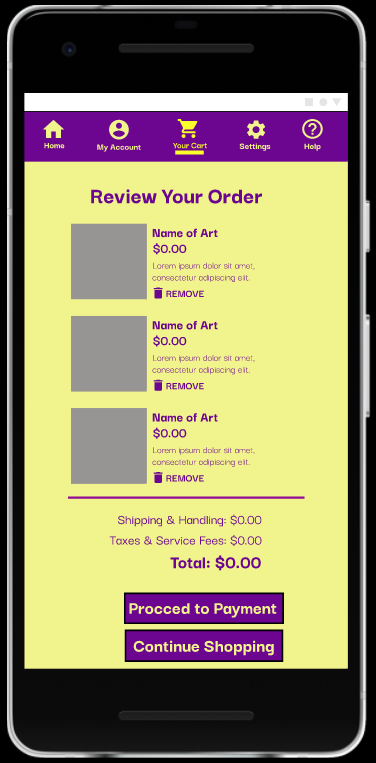
After another usability study, I made more revisions to the look of the high-fidelity prototype. The colors seem to be a little too vibrant for some of the users. They mentioned toning down the colors or changing the entire color scheme altogether. To make it easier, I swapped out the yellow for white instead. This made the app look more modern and artsy. The changes also included accessibility considerations.
You can find the high-fidelity prototype below.
