Project Overview
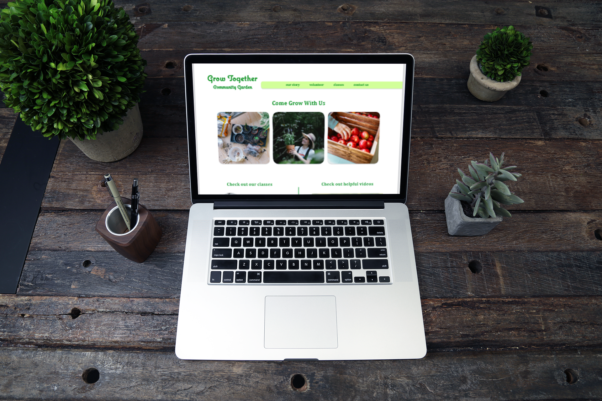
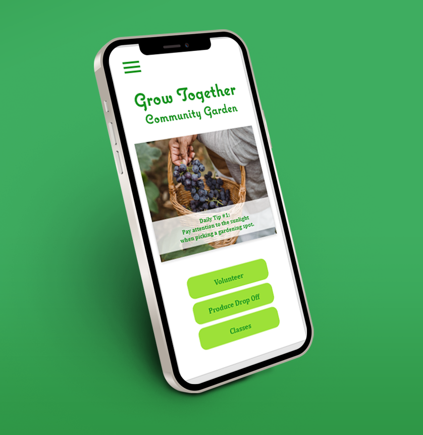
The product: A dedicated mobile app and responsive website for a local community garden. This app and website will contribute to the organization’s goal to provide ample food for the community.
Project duration: September 2021 - October 2021
The problem: A local community needed a way to help provide an ample amount of food for everyone through a community garden.
The goal: Create a dedicated mobile app and responsive website for a community garden that would help provide more food for everyone.
Understanding the User
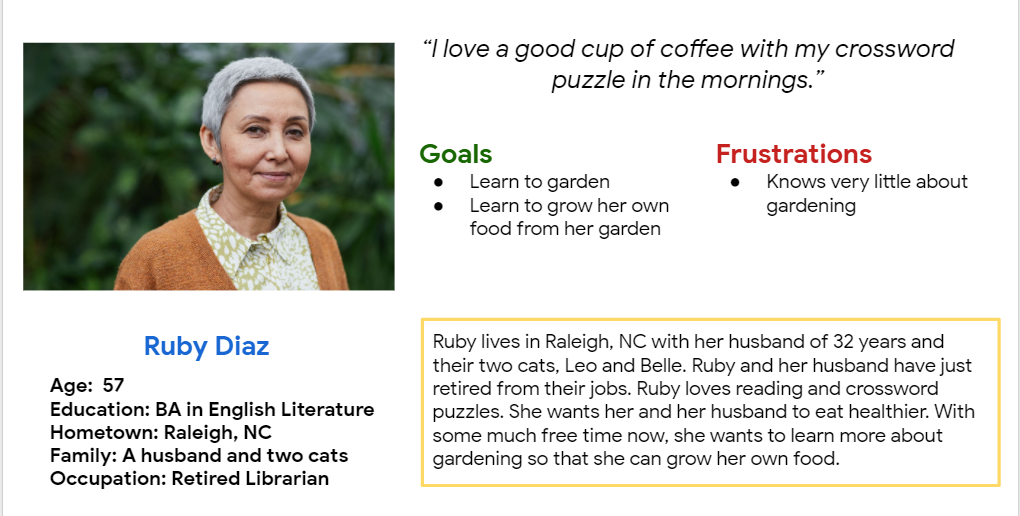
Research Summary: The first initial research included gathering information regarding user pain points, creating user personas, and conducting a competitive audit.
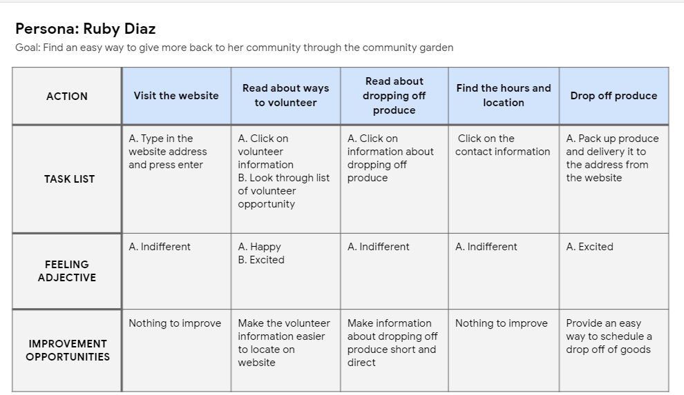
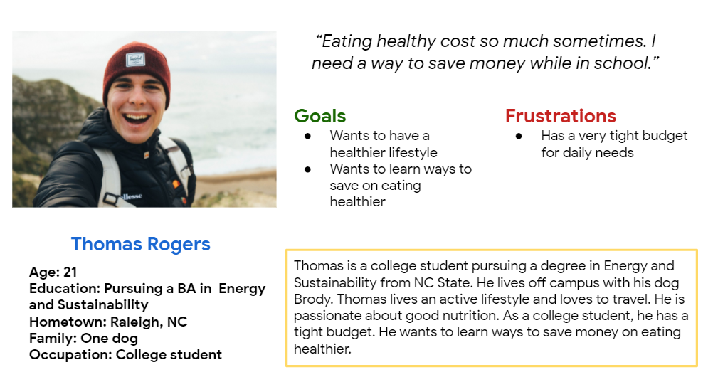
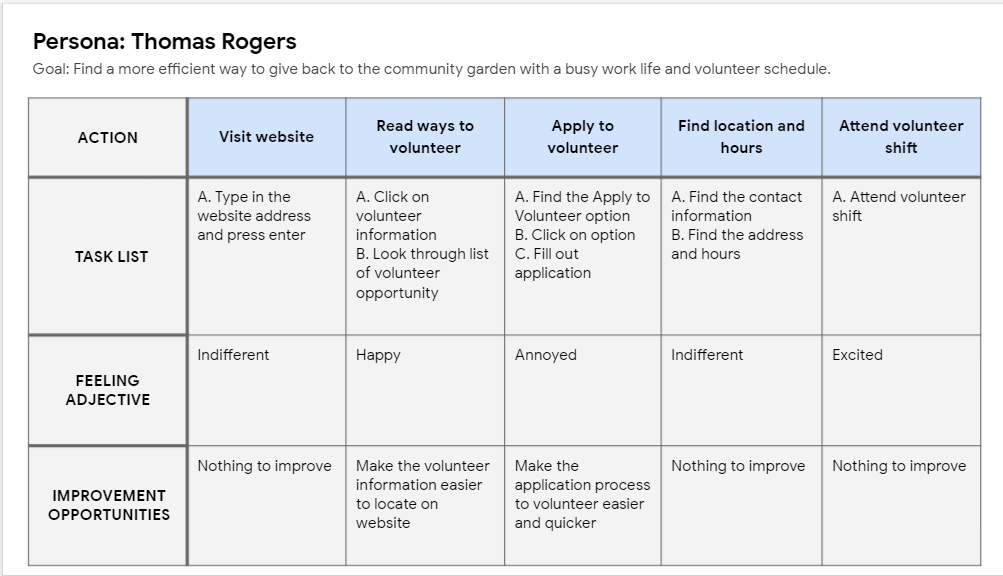
Two personas were created to help pinpoint user pain points. For example, users wanted a website that allowed them to easily find gardening tips. Along with these persons, user journey maps were created for the tasks the users would potentially take.
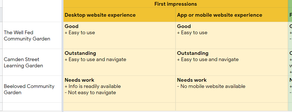
Competitive Audit: I did a competitive audit for 3 local community gardens: The Well Fed Community Garden, Camden Street Learning Garden, and Beeloved Community Garden.
My goal was to find their strengths and weaknesses so that I can create a better user experience for my own.



Ideation Process
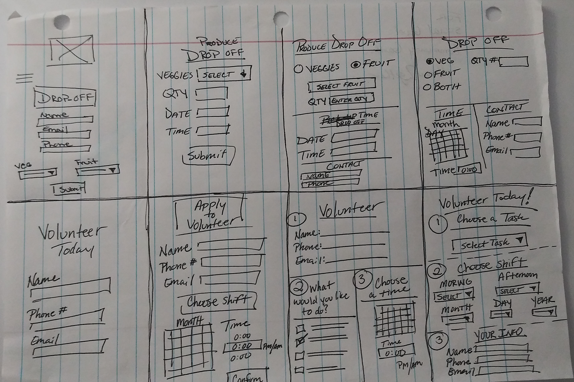
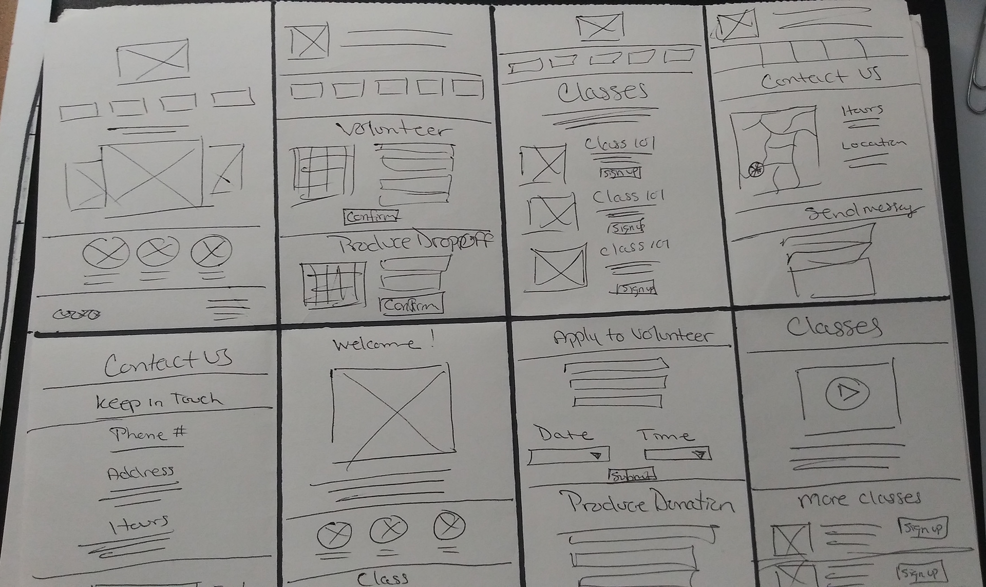
After collecting information to create the user personas in this case study and the competitive audit, I decided to start the ideation process. To quickly come up with ideas, I decided to use the Crazy 8's sketching exercise. I tried to keep in mind what would be easier for the user which included placement of the buttons, the potential user journey, and any pain points that would occur during the user journey.
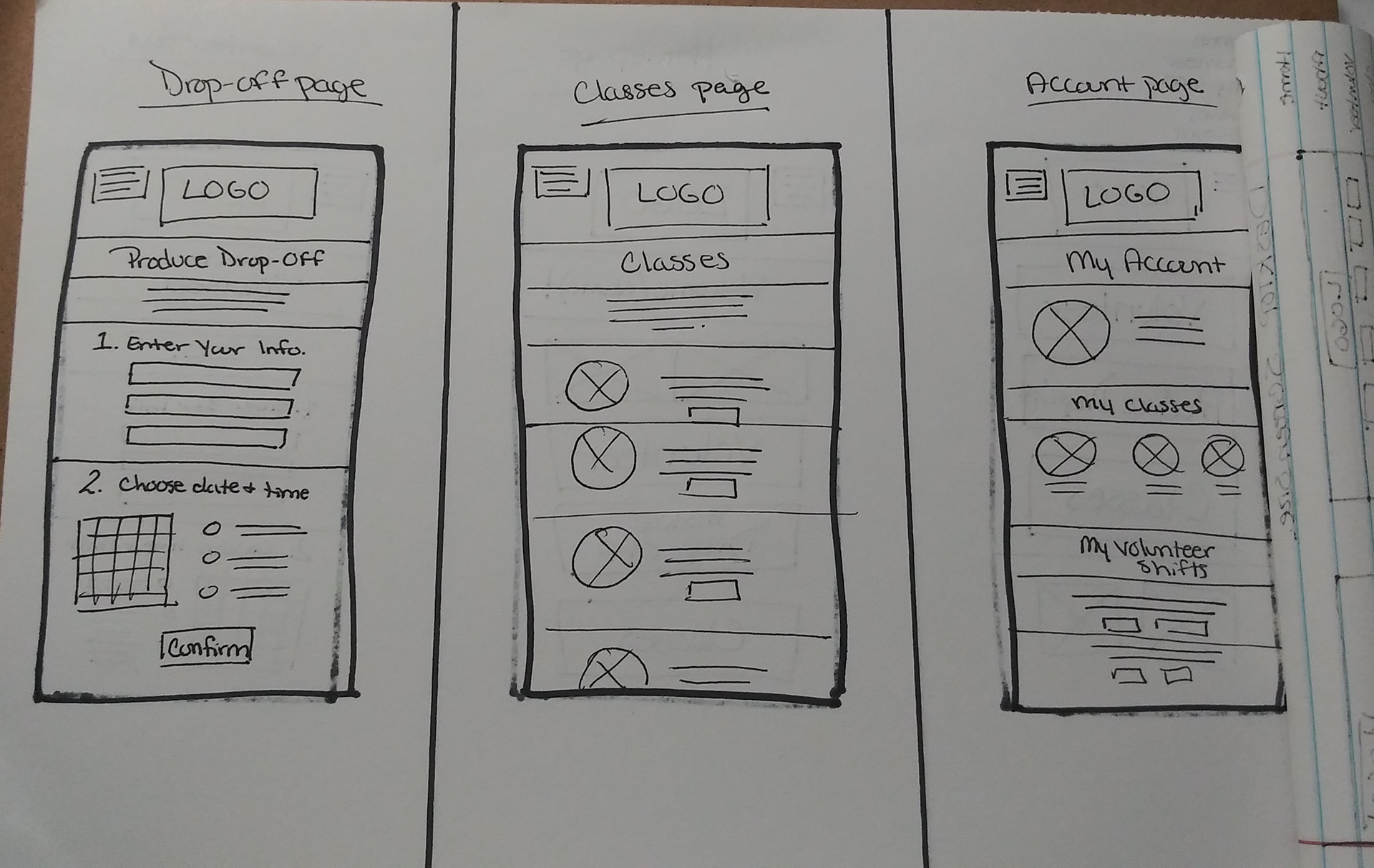
After the exercise, I proceeded to pick out my favorite parts of the quick sketches and sketch up the final design I wished to bring to life in the design process.
Starting the Design
After finalizing the sketch ideas I wanted to use, I proceeded to the design stage. With these wireframes, I did not include any photos or colors just yet. I tried to include real text to help users during the usability study.
I wanted to include as much as I could that would help users complete the user journey without focusing on the visual part of the design. The journey would include signing up for volunteer shifts and booking a time to drop off produce.
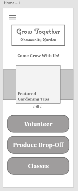

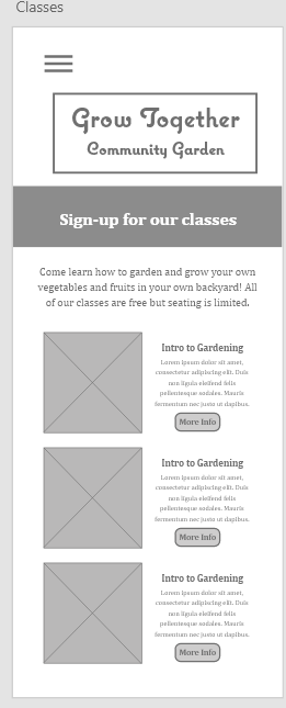
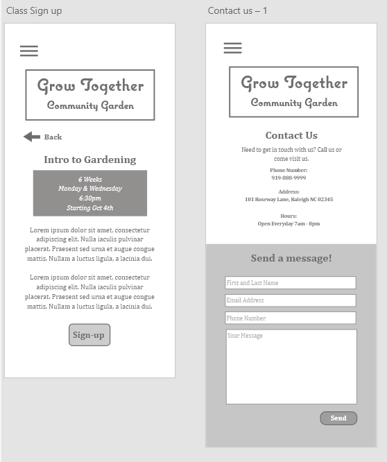
During this phase, I created digital wireframes that showed where the elements would be on the app page. Then, I turned those digital wireframes into a low-fidelity prototype.
Usability Study: Parameters
Study type: Unmoderated usability study
Location: the United States, remote
Number of Participants: 5
Length of Study: 25-30 minutes
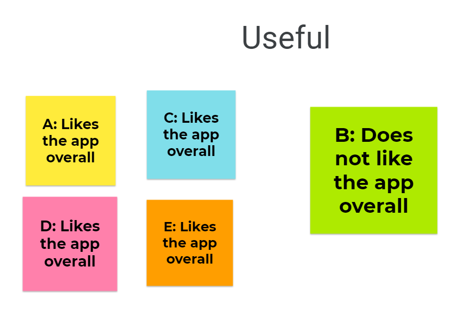
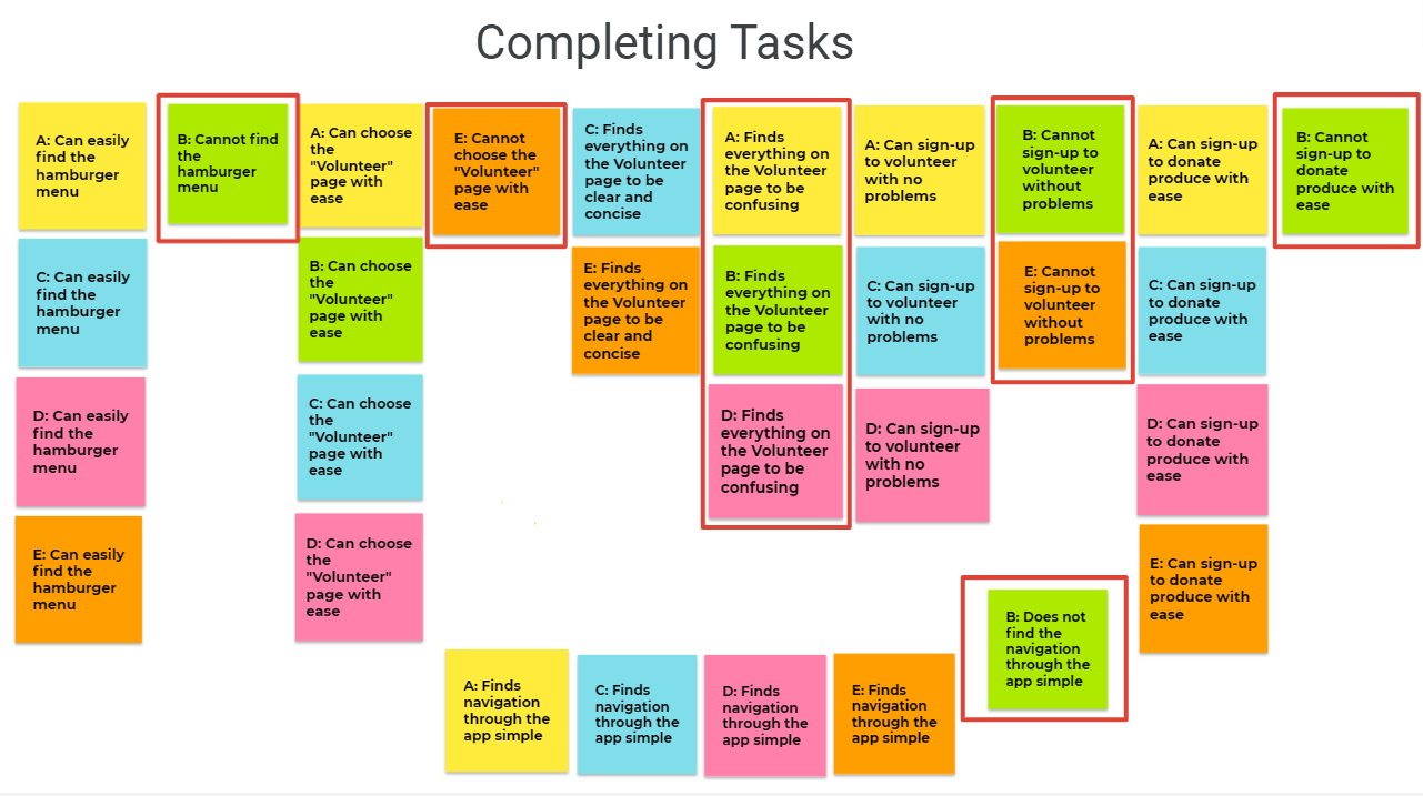
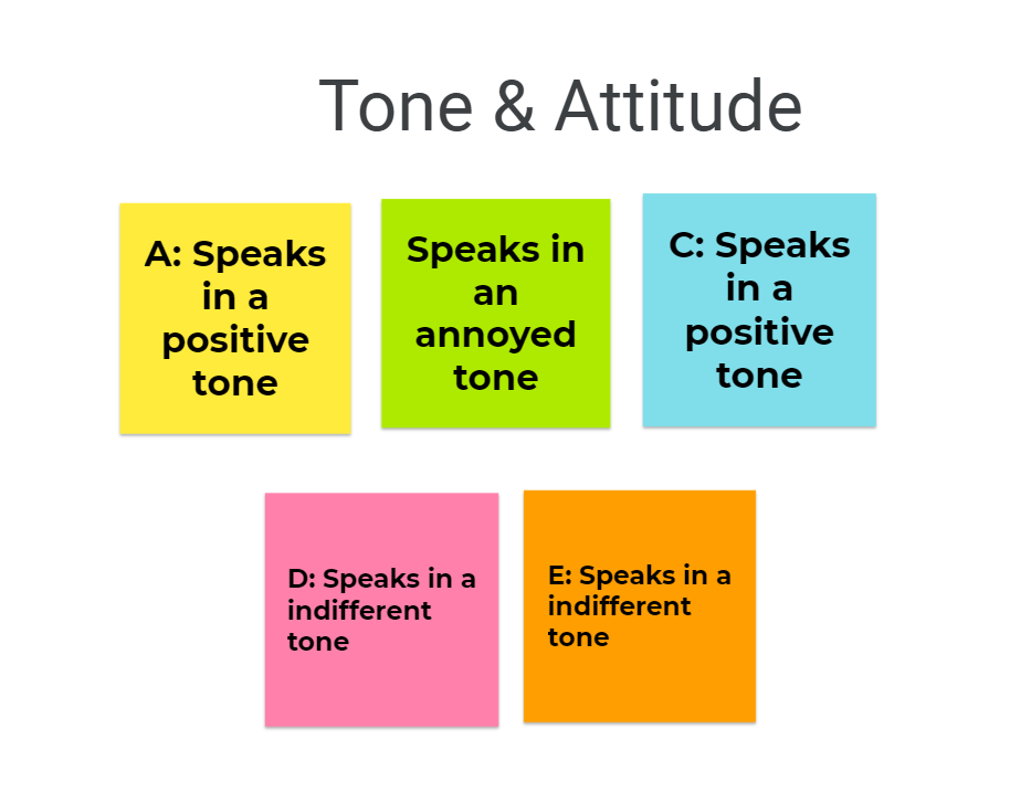
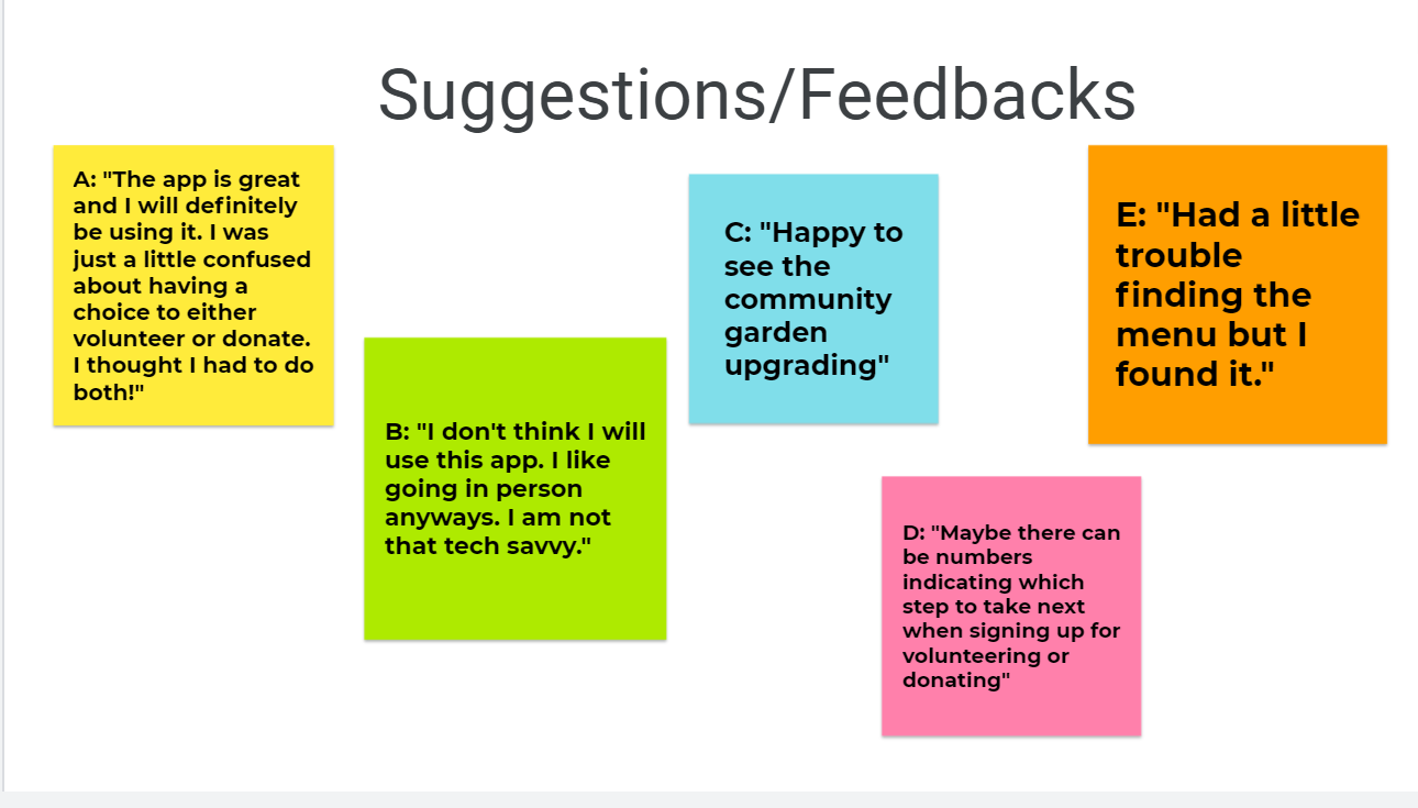
Below you will find the process which was taken after collecting data from the usability study. I used a digital sticky note platform to organize the data that was collected. Then, I used that information to find patterns that would help me with further iterations for the design.
Refining the Design
The findings from the study were used to make iterations to the design. The volunteer and donation pages were combined previously but are now separated to help users. To help users find the menu easier, the layout was rearranged to solve this user pain point. With a few more adjustments to improve the user experience, the high-fidelity was created with final iterations.

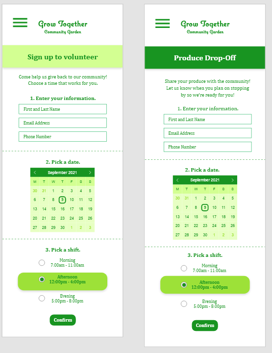
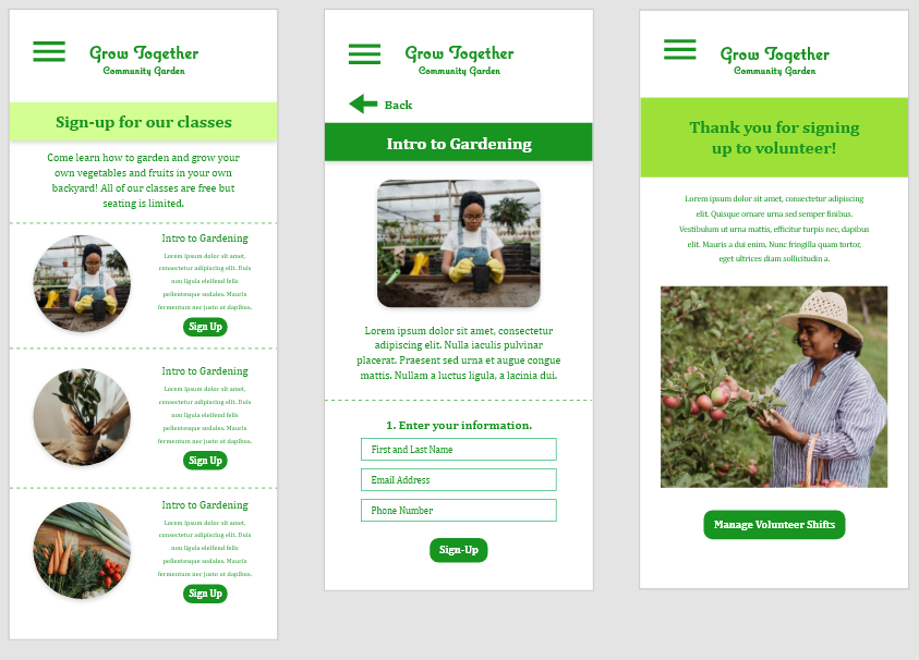
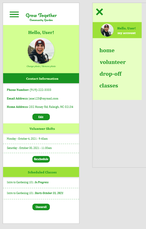
The prototype allows you to see the main user flows which are visiting the volunteer page, produce drop-off page, and classes.
Responsive Design
The sitemap was created to help layout the responsive website. For this website, I created a deep site map.
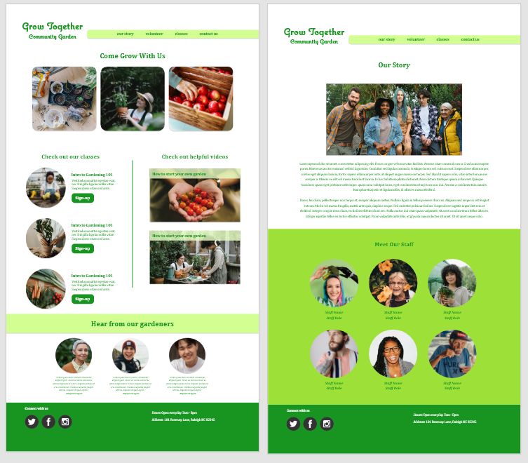
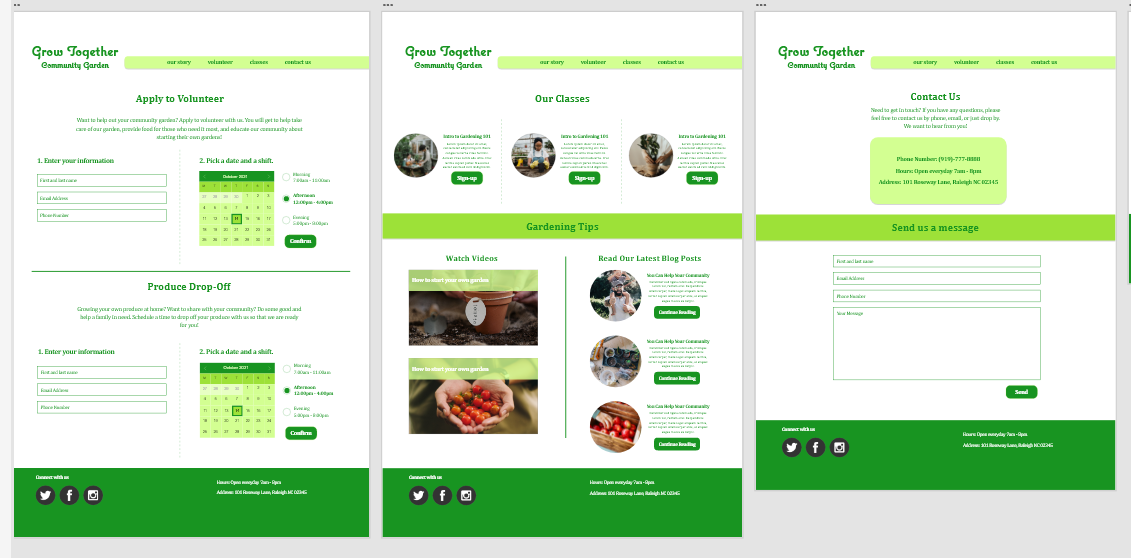
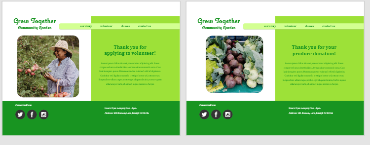
Explore the prototype for the desktop version below
Takeaways
Impact: The dedicated mobile app will allow those in the local community to help each other create a space to develop gardening skills. These skills will help provide an ample amount of food for everyone. The app will also allow those who wish to share their produce with others in the community easier.
What I learned: This project made me take more careful consideration towards what the user really wants and needs. I also learned the importance of an easy layout across various devices to improve the user experience.
